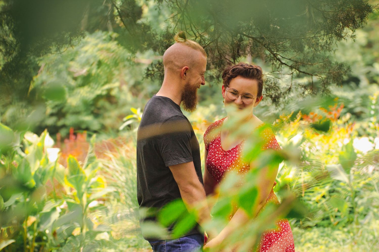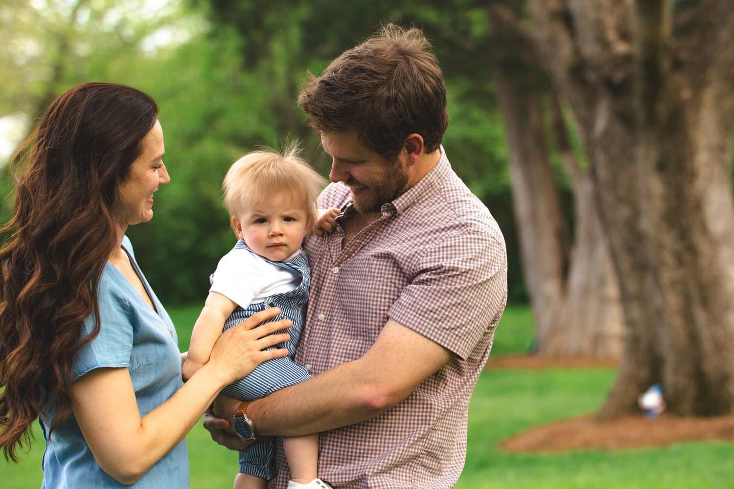
Let's be so for real...
Picking outfits for your photoshoot is the hardest part of the whole event. Choosing colors, patterns, and fabrics that work well together can feel overwhelming. Hopefully, this blog helps ease some of that stress and inspires a few ideas you can pull straight from your own closet.
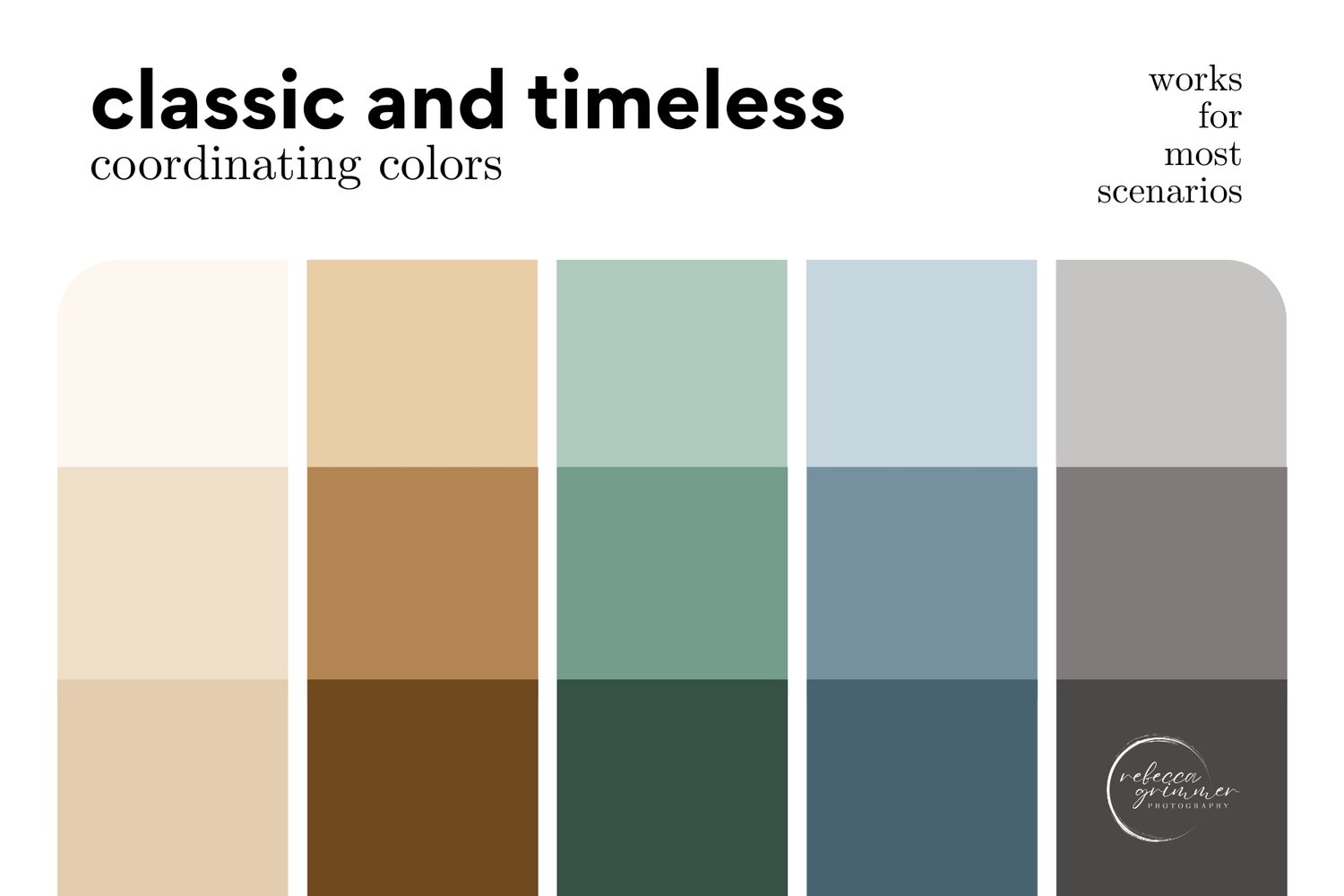
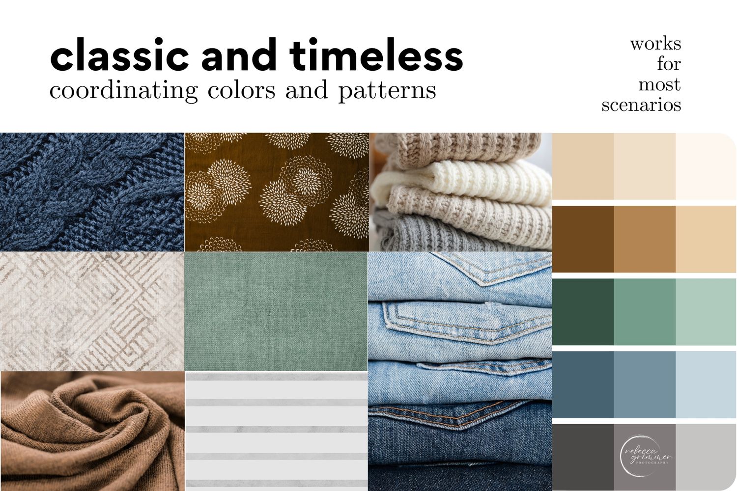
classic and timeless
I won't go on and on like a recipe blog. You're probably here just to see the pictures.
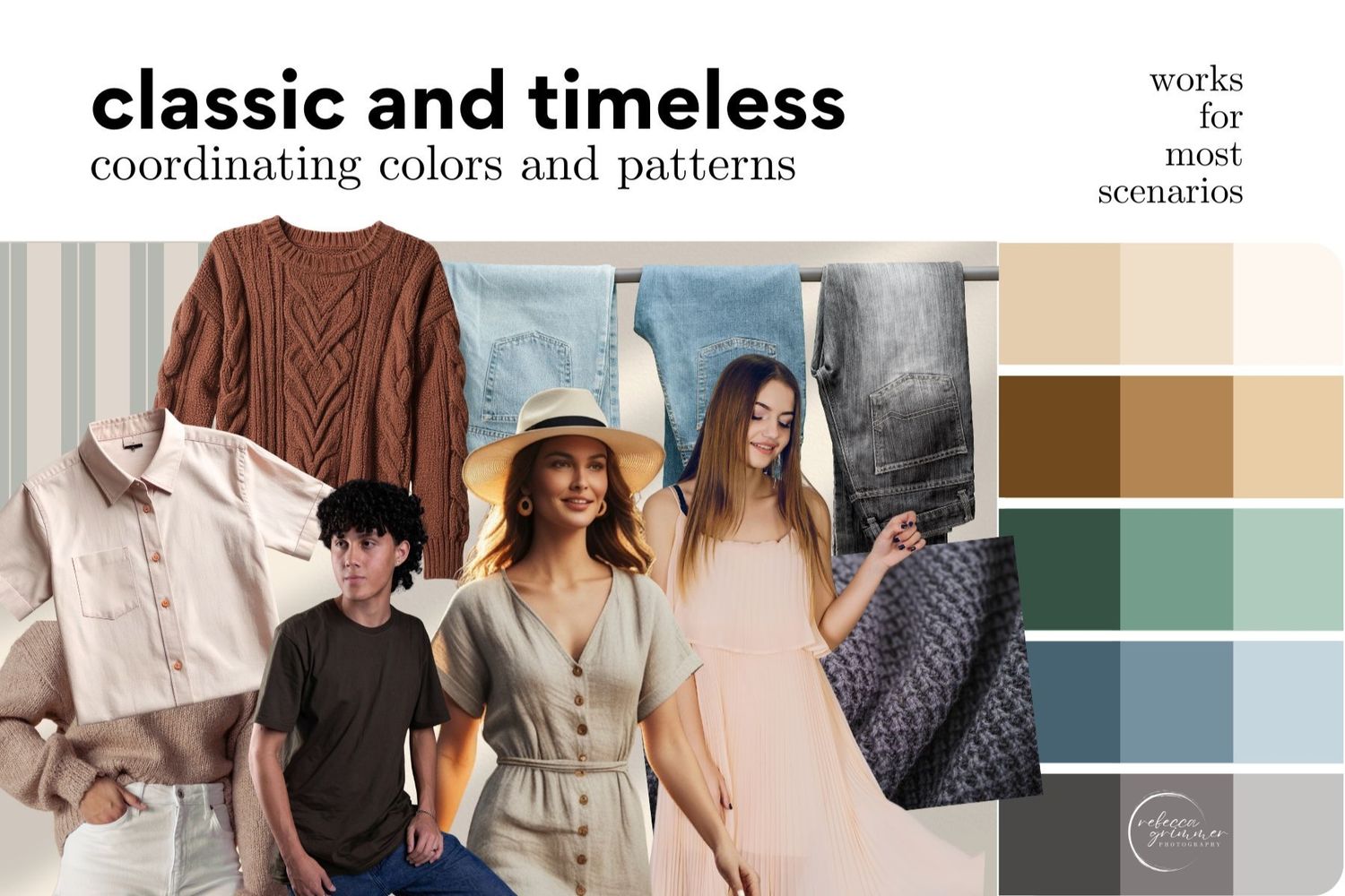
The simplest and “safest” color combinations that work in almost any setting are beige, brown, gray-green, slate blue, and gray. These tones live in a calm, neutral space. They don’t distract or pull attention away from the subjects — they enhance them. And enhancement is the goal.
These are just suggestions, of course. Choose two or three color families and stay within those tones, and you’ll be golden.
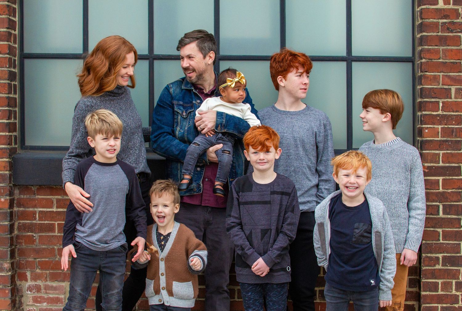
Mix and coordinate — don’t match. Matching pants, shirts, and shoes gives major Ft. Walton Beach trip ’99 vibes. (And honestly, what a great vacation — I had those photos taken too.) When you mix and coordinate, the eye is drawn to each person individually instead of focusing on the white shirts and jeans that almost match perfectly.
These colors work beautifully in just about any setting, from outdoor sessions to corporate headshots.
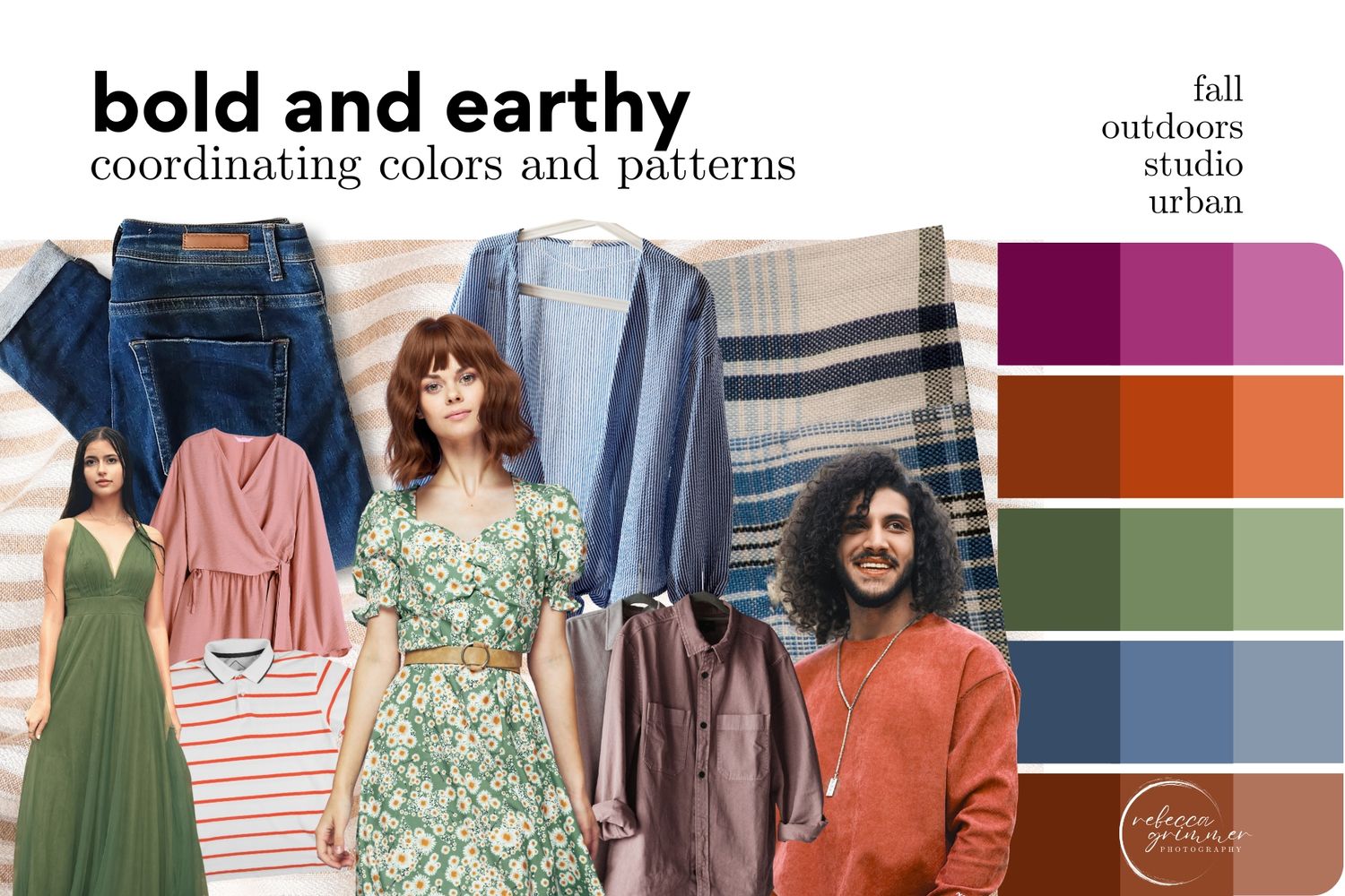
BOLD AND EARTHY
Maybe you're a color lover...
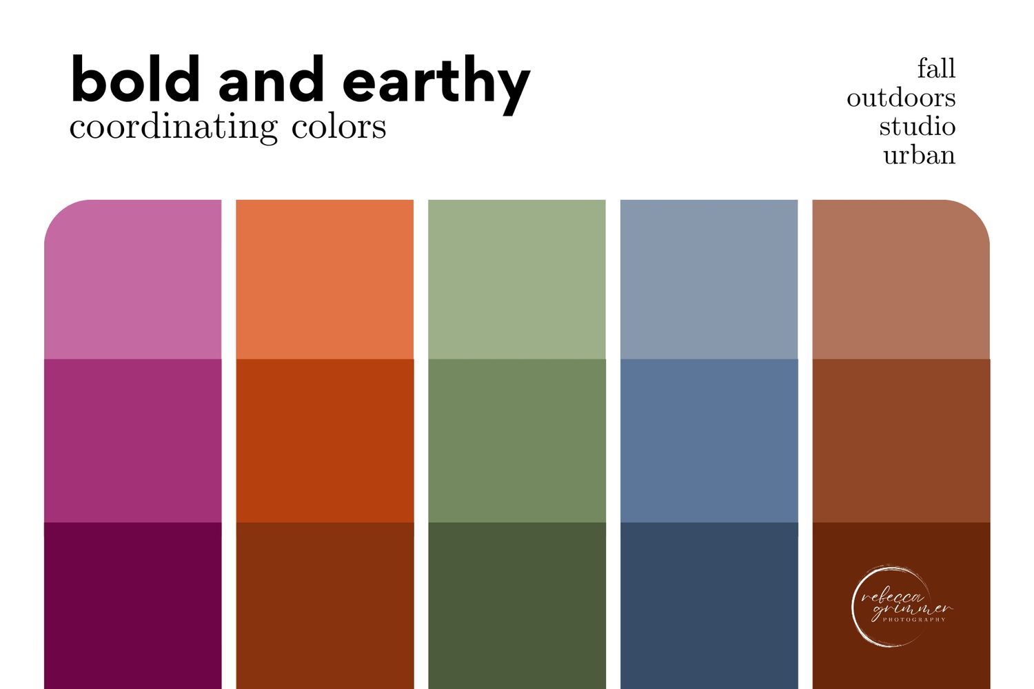
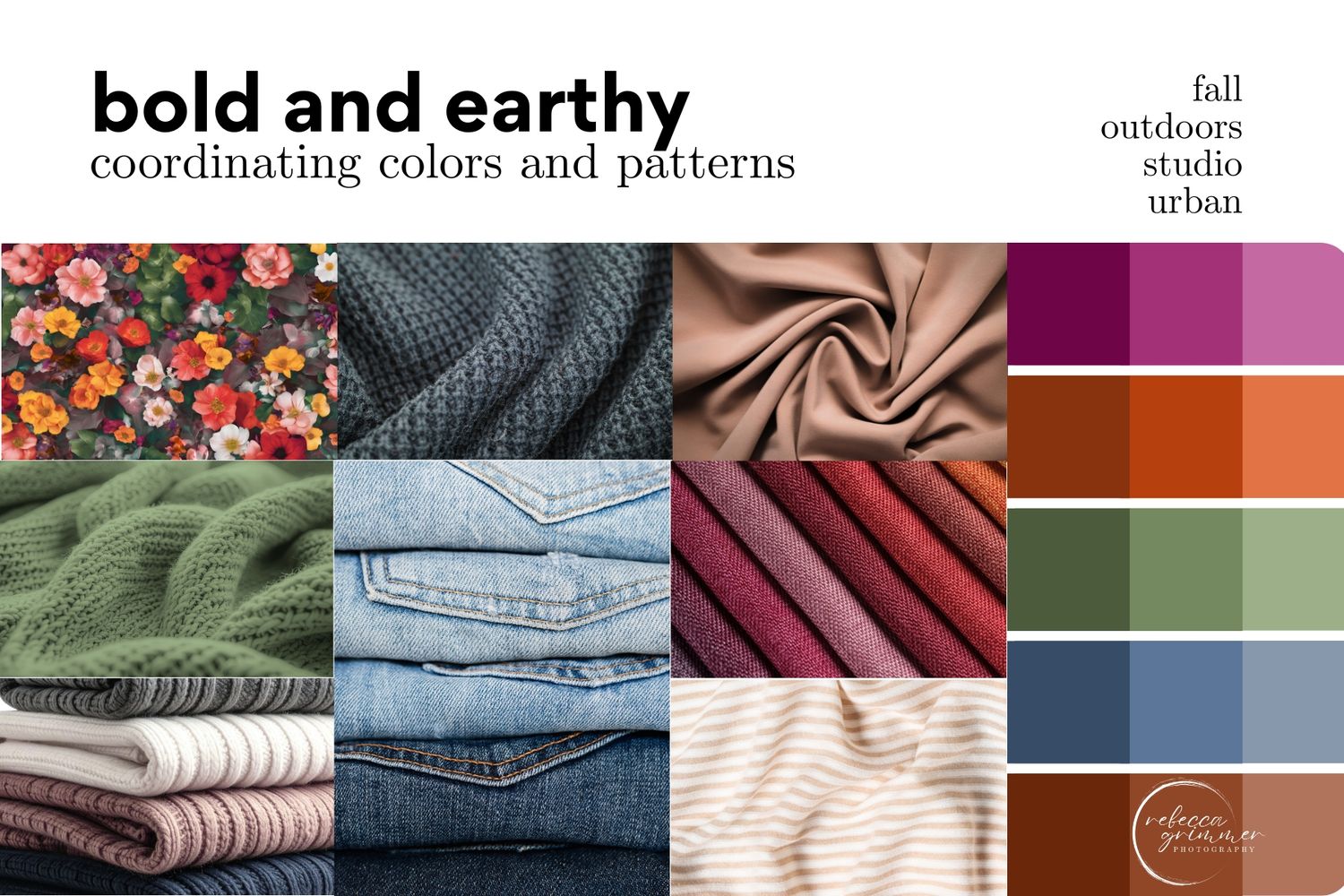
These colors pair beautifully with outdoor settings, especially in the fall. Many clients love the changing leaves and crisp autumn weather, and these tones complement that season perfectly.
Just like with classic, timeless colors, choose a few color families and stay within that range — particularly when working with darker hues. Used too heavily, they can become overpowering. The examples below show how this can be done in a balanced, cohesive way.
Another great option is an urban setting with neutral-toned buildings. The simplicity of the surroundings allows the colors to pop and draws full attention to the subjects of the photograph.
soft pastels
Maybe you're a color lover, but you're quiet about it..
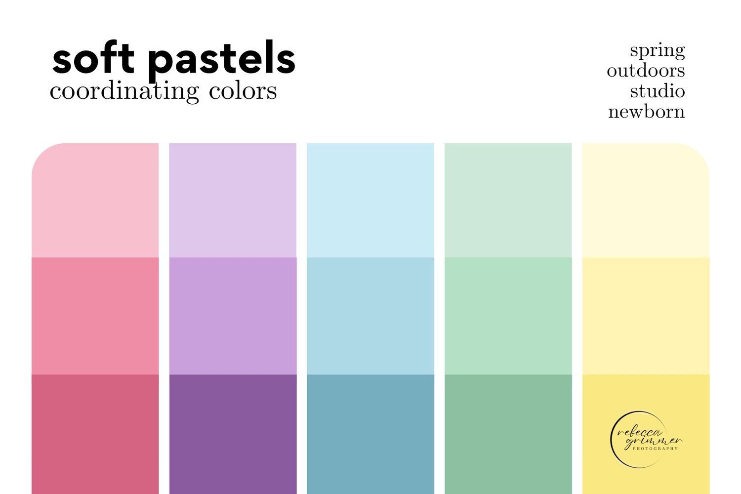
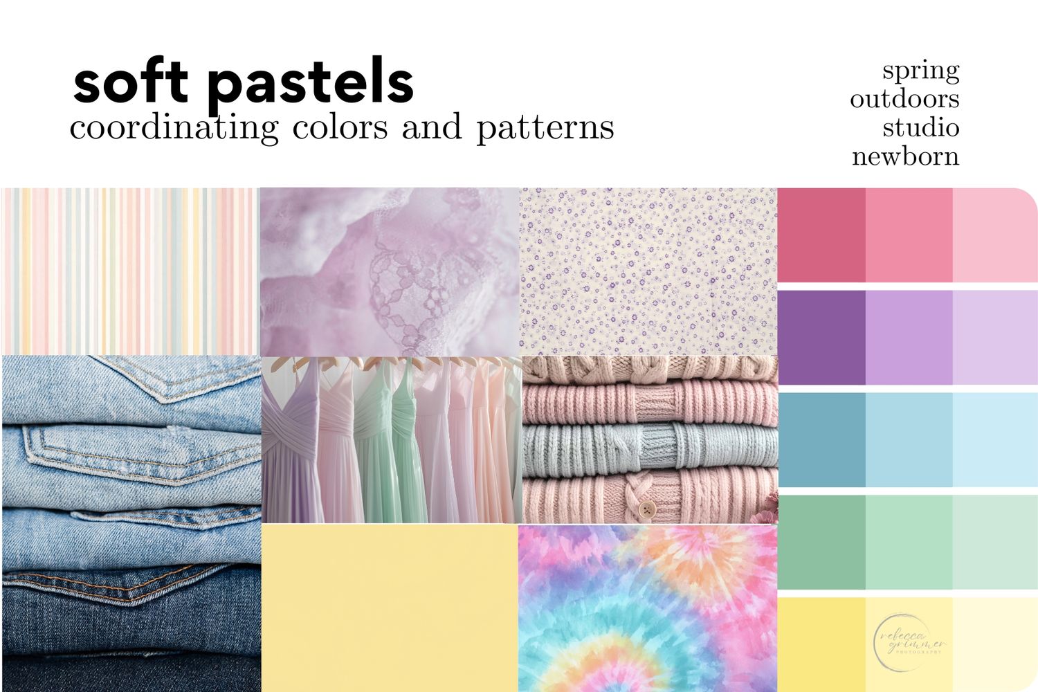
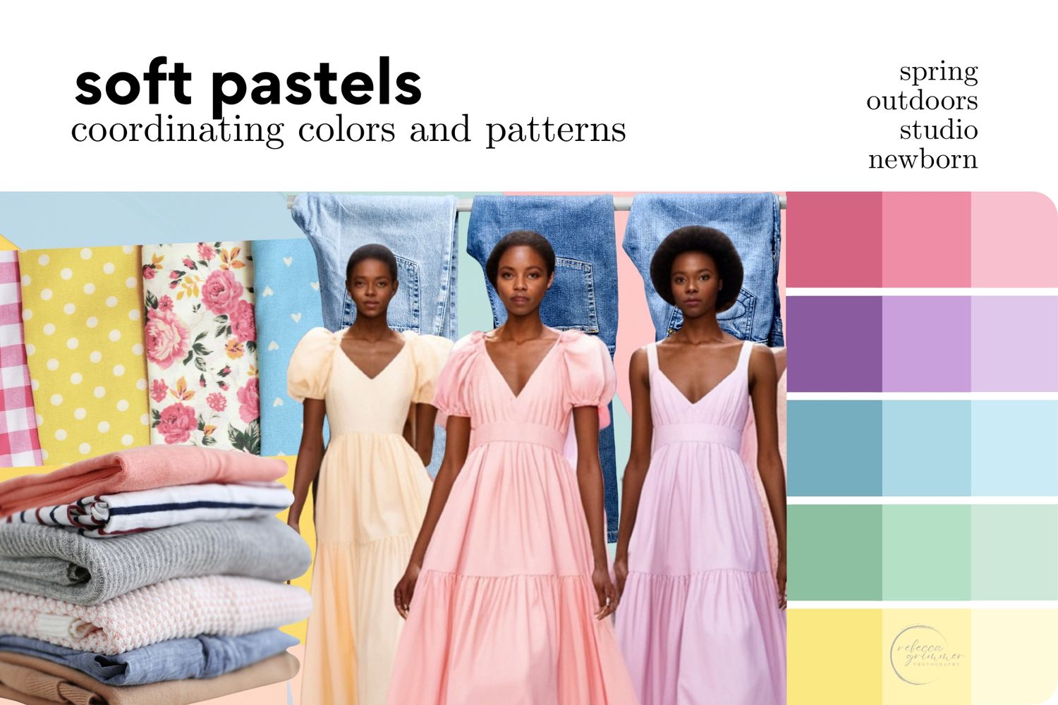
Soft spring colors and gentle pastels work beautifully for outdoor spring sessions. The new buds on the trees and flowers beginning to bloom on those cool April days complement the freshness of these hues perfectly.
If you’re not an outdoorsy person but still love a touch of color, these shades also translate beautifully in a studio setting.
MORE COLOR PALETTES...
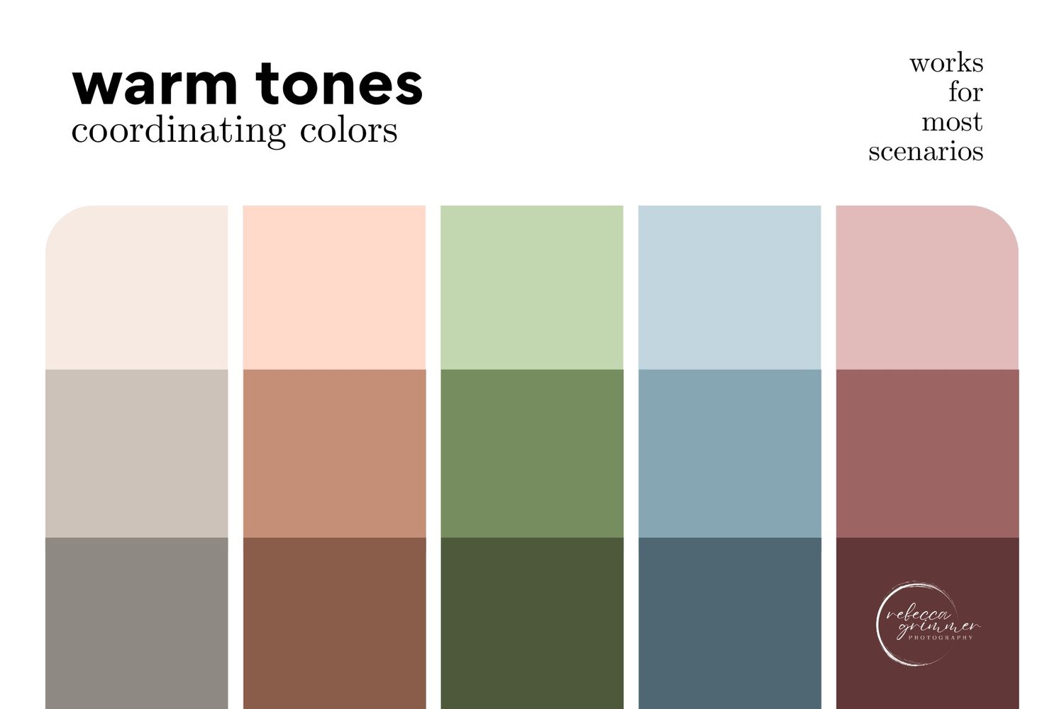
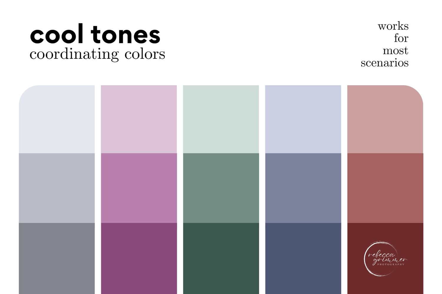
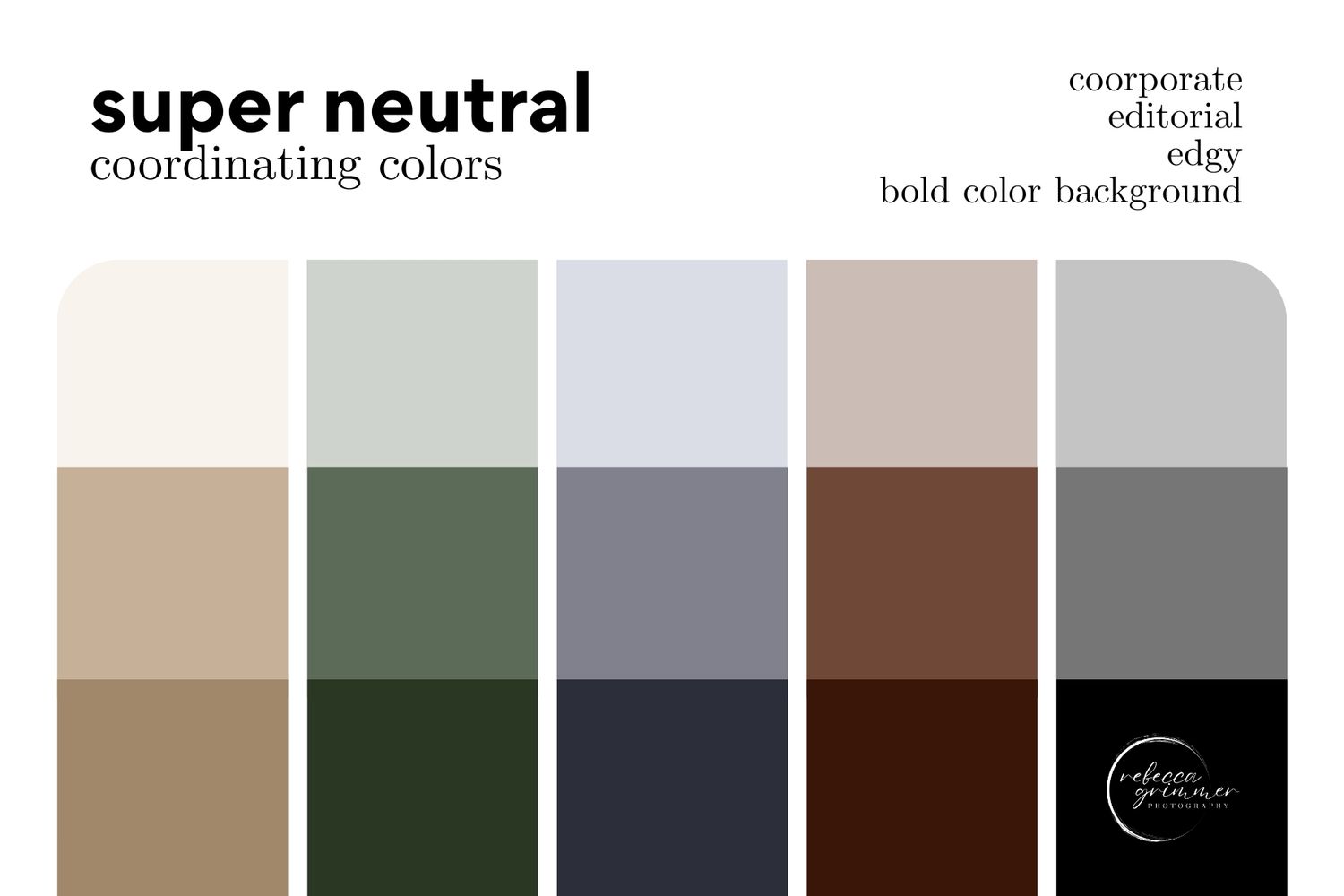
If you tend to gravitate toward warm tones or cool tones, these palettes work especially well for individual portrait sessions. The super neutral options lean more business or corporate, but they can easily be adapted to suit just about any setting.
ultimately...
Wear who you are.
There are tons of tones to pick from. Hopefully, these palettes will help spark ideas on what is best for you. Try to match what you already have in your closet. Pick out something that makes you feel confident, comfortable, and most importantly, like you. Constantly adjusting an uncomfortable waistband, loose strap, or worrying about how something fits will take you out of your experience, potentially causing tension in your mind and body. Think about the pieces you already love. Not only do you know what makes you feel confident and comfortable, it will save you some money. And if you do need to order something, give yourself plenty of time. Don't rush to Amazon the night before.
Confidence is key.
When you feel good and comfortable in what you are wearing, you can let go and enjoy the moment. The prep work is worth it, I promise.